Posted on 2 Comments

2014 March 16 TOSCA

Opera

I didn’t think I would like it, but I’d give it a try once.

So back in the late 1900s I saw there was a performance of The Marriage of Figaro performed by marionettes. Thinking, ‘yeah, I like marionettes, I’ll give marionette opera a try. There’s subtitles, it’ll be fine’.

Imagine, if you will, wooden people bouncing around on strings singing “Figaro, Fig-a-ro, FIG-aroooooo”, with their only emotional expression coming from how high or low their skinny arms are pulled.

La,” wooden hand up, “lalalalalala“, wooden hand down, “LA“, wooden hand waving in flourish, “laaaaaaaaa“.

Bad.

Since my Italian grandfather loved opera and his sister sang opera, I wanted to give it a fair chance. Fortunately, I caught a modern adaptation of Don Giovanni with subtitles on PBS and LOVED it. Later on I even saw a live production of Cosi Fan Tutti in Boston with real human beings in it and enjoyed that as well, if only cuz of it’s “Three’s Company” farcical style plot.

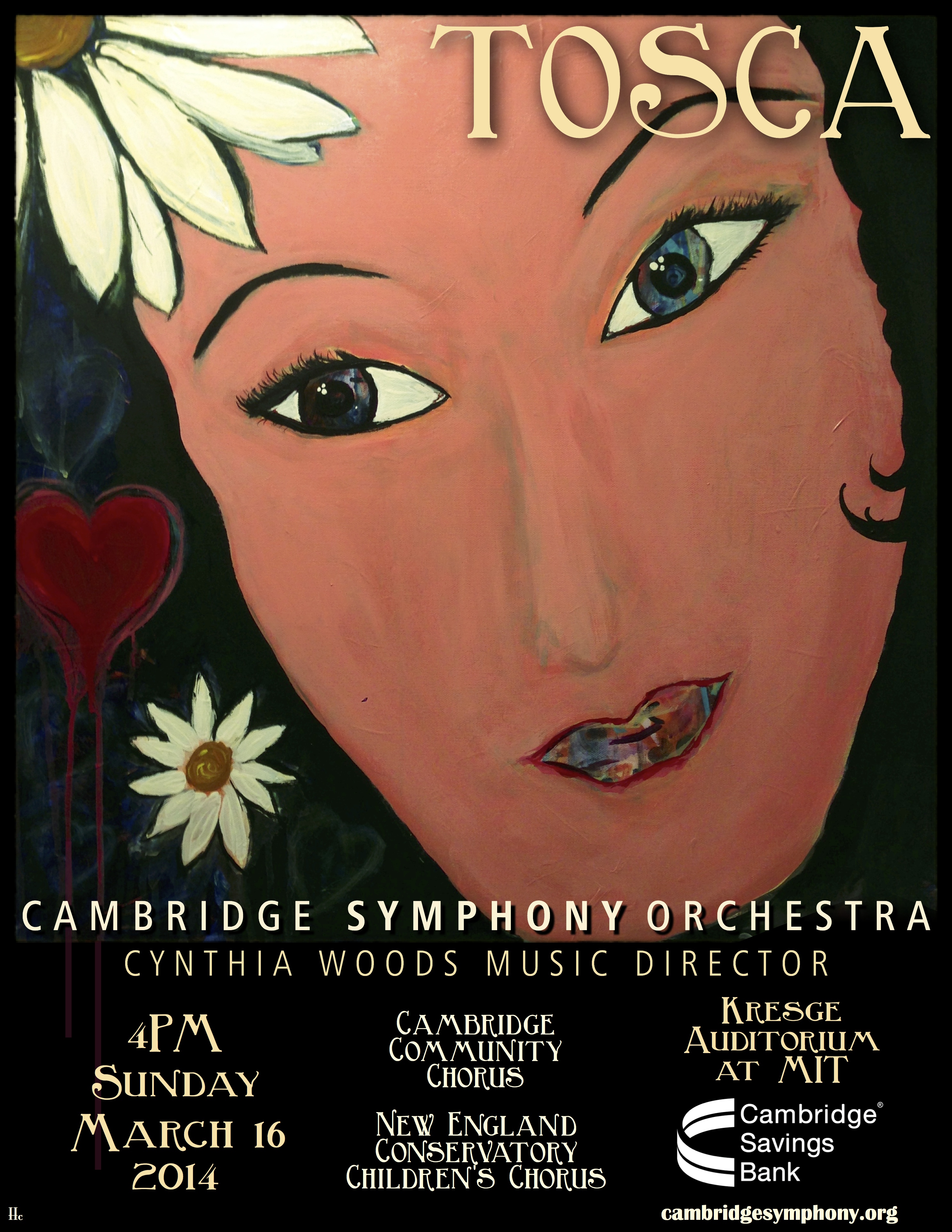
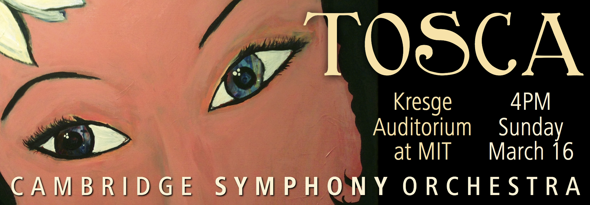
I wish my grandfather and his sister were around to see our Cambridge Symphony Orchestra production of Tosca on Sunday March 16.

So, the poster… what the heck do I do?

I was stumped at the enormity of the task as I knew how excited everyone is to get this right. I was frozen trying to come up with imagery that will dignify the event.

I started with doodles in my engineering notebook during a meeting.

20140307-110953.jpg

I doodled up a dagger with a hilt that looked like a violin sound hole. Thought, hey cool, and was on my way. I spent the weekend in my art space in my basement with India inks, acrylic paint, tissue paper, and cut paper. Spent some time figuring out how to draw an art nouveau font, and came up with this.

20140307-110905.jpg

And then, thinking the concert will be in springtime I decided to make the red pop by putting it on an aqua background.

20140307-110805.jpg

All the while I’m working on the clever dagger idea this is sitting on the easel behind me.

easelfloria

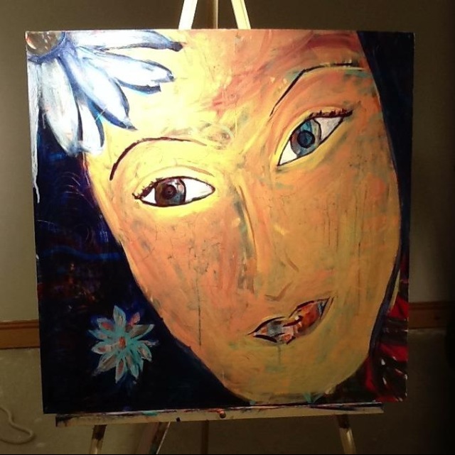
In 2012 I’d taken Flora Bowley’s ecourse to get back into painting, which I hadn’t done at any length since I was a teenager. Her approach has you just painting a bunch of gobbledy-gook with fluid acrylics, honing and fixing, until you work it up into something truly unique… as you had no idea what you were going to paint when you started. She wants you to have messy underpaintings.

This is the underpainting for what became the final Tosca poster.

20140307-112423.jpg

Embarrassing, a bit, to show it here, but I wanted to show that I was going for an angry red busy unsettling vibe when I painted it.

Then, in the ecourse, Flora suggests going big and bold, draw a big image, make a big change, be unexpected. I painted a big face over the angry red background, I wanted a pretty face, but where you could still see the messy disturbed underpainting in the eyes.

And there she sat for months, in my basement, I didn’t know where to take it.

20140307-111847.jpg

With this painting behind me and the cheery dagger painting in front of me I rented a Tosca DVD and figured I’d let the story percolate so I would have a better clue of how to make this right.

Here’s the TL;DR of Tosca: Tosca has a painter boyfriend, she’s jealous, she’s pretty, creepy guys are into her, and she would kill a man if she had to.

And her name is Floria. Floria, come stai?

2014March16Tosca2by3

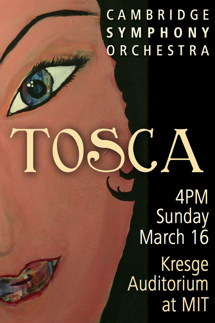
Now I knew what to do with the painting.

2014March16Tosca5_75by2

Come to the concert… find out what happens to her.

2014March16ToscaCSOlady2


Posted on

2013 CSO Concert Poster, “Leaving Home: Music of World War II”

Let me tell you a little bit about the process of making this poster for our concert next Sunday, November 10.

2013 Nov 10 CSO Concert Poster

 What do you see when you look at it? I wonder.

Dabbling in this new world of graphic design I’m always thinking about what’s the most important thing to have when I declare it finished. I figure it needs to attract people’s attention “hey, what’s this?” and it needs to identify the content of the concert so people can decide if they would want to attend, with a compelling image for the visual people as well as cleanly formatted wording for the readers.

I like to play the music before I start in on designing the poster. I like to get a visceral sense of the program and then get to work portraying those feelings with the imagery. In the first rehearsals Cynthia Woods, our conductor, runs us through the music so we can see all the notes and learn our tempos (tempi?) and such. Truth be told I was not loving this program as I played it for the first time, it felt uncomfortable to me, it didn’t flow how I like music to flow, the meters were different and unsettling as nice as the melodies were.

Then Cynthia explained that this piece that we were playing was written in a concentration camp during WWII, that only one of the composers and players survived the war bringing these scores with him, and that this concert was in support and supported by the Terezin Music Foundation. If you click over to their website you will immediately hear one of the pieces.

I had a hard time playing the rest of rehearsal without welling up. Cynthia went on to say that though the music was written under difficult circumstances there was still a lot of joy in it since music was what they loved and they could find comfort there when they played.

so, the poster.

what in the sam hill can I put on the poster?

I talked about it with a few people, explaining the context and purpose of what I was trying to do. A fella at work gave me the solution, he said that I needed to represent what the musicians in the camps wanted when they played this music. And this answer was easy… home. There can be little doubt that these people would have simply wanted “home”.


Over the past year I’ve been lucky enough to take a jumble of mixed media, painting, and drawing classes from different sources that I found from my classes and connections at the Squam Art Workshops. Alena Hennessy got me mixing paint, papers, and ink. Kerry Ann Lemon showed how to be comfortable drawing with straight black ink. And my cabinmate clued me in on a great series of art journalling videos from Teesha Moore, which also focused on the use of cut paper.

With all these new materials and papers I sat down to work. This is the first time I’ve done a poster from the position of making a separate piece of art and incorporating it onto the digital page, versus just building the poster entirely on my computer.

Here’s the first one I did (with some edits to try white inked notes after completing the second one). I had papers that looked explicitly like wallpaper and tried crafting a violin that in itself looked like home. And then I learned a new lesson: digital images of a colorful piece of art don’t always properly represent the real life image. The violin on this first version has a very bright yellow pattern on the paper, but with all the photo editing in the world I couldn’t get the image to show like it did in real life.

Terezin hand cut paper violin 1

So I started in on a second version that used even brighter paper. The violin isn’t as accurate in proportion as the first one, but the colors and overall vibe of the image felt better to use. Also, the notation floating away in black ink below works better than the white notes above.

Terezin hand cut paper violin 2

I have to say that I’m a bit uncomfortable showing these two untouched images since I don’t consider them “finished”, but I wanted to show the influence of why I took this route while giving credit to the teachers who showed me how to use all these materials: that it’s “ok” to mix this stuff up, there are no rules.

Looking at the images I see parts that I could have done better, it looks a little clunky to me, in my head what I wanted to do looked different from this. But, as you can see at the top, I’m ok with how the whole ensemble of information and visuals work together.

So I wonder if people get the sense of “home in music” when they look at this image. I do hope the poster brings people to fill the seats to listen to the work of these musicians. And I hope we at the CSO can do this music justice.

OK, I’m going to go practice now. – H


Posted on

2013 November 10 CSO Ad

Dusting off my graphic design skills, the first Cambridge Symphony Orchestra work for the season is an ad for our first concert that will be used in programs and other small media.

Our program for this November show focuses on the music of World War II, and I hope this reflects in the design. Many propaganda posters of the time had color bands across the top and bottom framing a black and white image in the center. This image is a macro I shot of my own violin, and I brought the colors back to a drastic outline to work in greytones.

2013Nov10ad5x4

Another thing I consider, if silly, is matching the logo of our benefactors when they are incorporated into the posters. So blue it is.

Come see us play on this Sunday in November. The guest violinist, Irina Muresanu, is a wonder in her own right.  We will be in Somerville at the Center for the Arts at the Armory.


Posted on

What is the sound of two multiverses clapping?

Had my eye on the World Science Festival for a few years now. 2013 was the year the forces of the cosmos aligned and I was able to go. Fortunately I didn’t have to twist my BF’s arm to take the trip to NYC for this event, as he is a big nerd too.

We attended 4 events, had to get tickets ahead of time because things seemed to be selling out (yay, science!). Signed up for Spooky Action: The Drama of Quantum Mechanics – Thursday 5/30/2013 8pm, Infinity – Friday 5/31/2013 8pm, Destiny and DNA – Saturday 6/1/2013 3pm, and Multiverse: One Universe or Many? – Saturday 6/1/2013 8pm

The whole thing, ‘cept for the big broadway performance from Brian Greene, was down at NYU, near Washington Square Park.

Washington Square Park

Spooky Action: The Drama of Quantum Mechanics – Thursday 5/30/2013 8pm

I don’t have any photos of this event as I followed instructions and didn’t take any inside the theater, tho if you search instagram and flickr you can find plenty of other people’s photos of the show. 🙂

Going in I was expecting the typical panel discussion, even though we were in a swanky legit Broadway theater. Turns out it was Brian Greene doing rehearsed stage schtick about Quantum Mechanics, spooky action, quantum entanglements, etc, with 3 other actors and a nice multimedia show projected behind him. My nerdly self was thrilled. Through this show they got complex ideas across as well as taught a bit of the history of how physicists like Einstein and his contemporaries worked through these game changing ideas.

next we attended:

Infinity – Friday 5/31/2013 8pm

The theater waiting for “Infinity” to begin.

How do I say this? Truthfully, “Infinity” my least favorite talk. The description for this one said “Does infinity exist? Can it be found in the physical world? What types of infinity are there?“. Really the group ended up speaking about the last question: “What types of infinity are there?” One guy was working on infinity past the highest number you can count to, another guy was working on the infinity that exists between numbers 3 and 4, i.e. 3.11111111111, 3.1415927, 3.99999999998, etc. Interesting to think about, in and of itself, but I felt like the group of guys was arguing a point without having that point defined, and so no one came to any conclusion. The whole discussion was nebulous, and I felt like I was watching a pissing contest where no one knew what they were aiming for.

I, an aetheist, found myself agreeing most often with the person representing philosophy and religion, Philip Clayton. He cut to the heart of the matter a couple of times, finding a point to the discussion where the others were often speaking about their own research as an answer to a question that wasn’t explicitly asked.

then it was:

Destiny and DNA – Saturday 6/1/2013 3pm

If you watch one video from this post, watch this one, as it will give you information that will help you understand things happening in medicine right now, and more widely so in the next few years.

Epigenetics.

The premise of this talk was that, before recently, scientists believed that we inherit our DNA cleanly when we are conceived. Turns out this is not the case, we instead inherit our DNA with our specific markers already turned on and off depending on the lives our parents and grandparents lived. Different genes and traits are favored by the software that runs on the hardware of our DNA.

There was a NOVA on this topic, btw, which, of course, explained the topic beautifully.

Things like a predisposition to be overweight, or to be stressed, or to be super fit, or the ability to live to the age of 100, are influenced by things including the nutrition and stress levels of parents. The speakers were always very careful in how they spoke, because they realized there can be implications if, say, someone decided to go out and sue their own mother for being stressed and therefore causing them to be unhealthy.

All of the members of the panel had their own interesting research to share, as well as ideas on more research that could be done.

And then, members of the audience asked the best questions, my favorite being about culture and such influencing the health profiles of entire populations.

and lastly,

Multiverse: One Universe or Many? – Saturday 6/1/2013 8pm

oop, look, here’s Brian Greene again introducing the discussion.

Brian Greene introduces the talk about the Multiverse

This talk was very good, basically because of this guy, John Hockenberry.

John Hockenberry moderated the Multiverse discussion

John Hockenberry (great name!) kept everyone grounded and added just the right amount of snark to keep the tone of the discussion in the realm of accessibility by the audience.

The discussion was between Andreas Albrecht, Alan Guth (MIT!), Andrei Linde, and Neil Turok. Each working on different theories on the origins of our universe including the possibility of other multiverses, the “uni” goes away when we open up to the possibility of having more than one. Three of the four were working with the theory of the existence of multiverses, and one, Linde, landed on the side of ‘nope, just the one’.

My favorite part of the talk (besides Hockenberry carrying us nicely through the discussion) was towards the end when Turok opened up the possibility that there’s not one, nor many, but TWO multiverses that exist in tandem, constantly influencing each other. Guth laughed at Turok’s video, calling it two universes clapping, and dismissed the theory outright… ‘cuz what is science but the proving and disproving of theories with experiments and calculations… or just outright mockery. The moment was funny because it was fun seeing the scientists “throw down” over REALLY abStRacT concepts. My own opinion would be to give the two multiverses clapping theory a chance, yeesh.

Oh, and check this out, people getting the physicists’ autographs.

Physicist signing autographs

Good times, to summarize: go to this event. The World Science Festival is a wonderfully unique experience connecting brainiacs with the curious public.

Nerd on!

– H

Click here for all my photos of the trip.

P.S. & as a post script let me point out the three places I got tasty gluten free food at while we were down there. Nizza, just west of Times Square in Hell’s Kitchen, had great dinner and brunch, completely gluten free savvy, reasonably priced, and delicious. Bareburger, near NYU, served just what you’re looking for when you order a hamburger. And Pie by the Pound, for GF pizza downtown, yum.

Yes, I let my BF have some of my root beer float at Bareburger.

Posted on 2 Comments

NYC for The World Science Festival

I got to go! The World Science Festival is usually on the same weekend as the Squam Art Workshops, so I hadn’t been able to make it in the past. My life is normally about Nerd Fun without enough art and creativity so I will always pick SAW over the WSF if lucky enough to have the choice. Here are my photos of the trip, I’ll do another post with details on the WSF events that we attended. Took AMTRAK, pretty relaxing so long as the train stays on the rails. Shot and edited with my iPhone5, fun shots of Queens on the way into town.

AMTRAK in NYC
Queens from the train
Queens

We showed up in NYC for the first weekend of the invasion of Citibike. We hemmed and hawed about using the bikes to get around the city all weekend. We are accustomed to seeing this sorta thing in Boston already, and thought it might be fun. We walked around Midtown and Times Square, visited the International Center for Photography (does no one take museum worthy photographs when they’re happy? whole? away from warzones? not bleeding? just gimme just one happy picture??), visited a friend who works in the city… all while thinking about going in for Citibikes. The ICP is near the lovely Bryant Park where we saw four fellas playing Pétanque (kinda like Bocce) AND, there was a girl, maybe 10 years old, doing tumbling runs on the grass, cartwheels, back-flips, all sorts of gymnastic awesomeness… didn’t take a picture, since it was a girl and this IS the internet, I mean, duh. But, wow, she was fantastic.

Still tho, Citibike? do we or don’t we? After pricing bike helmets knowing we each had helmets at home that we didn’t pack to take with us, we decided to get a two day pass for a hop-on-hop-off tour instead… more photo opportunities, more witty tour guide commentary, and more cool air (it was in the 90s and humid).

NYC Bus ride on a hot day.

I took a vertical panorama Times Square from the bus.

Vertical panorama from the bus

The Empire State Building from the bus.

vertical panorama with the Empire State Building

City shots … from the bus.

City Shot from the bus

Eataly.

Eataly

Marimekko over Madison Sq as seen from the bus.

Marimekko over Madison Sq as seen from the bus.
city street panorama

We hopped off the bus at Battery Park with the intent of going directly to the Skyscraper Museum. Now, Aram and I are pretty lucky in the stuff we happen upon. And by lucky, perhaps I mean intrigued by a lot of what we find, where maybe other people don’t give a damn. So then we found this: The National Museum of the American Indian, which is an offshoot of the Smithsonian Museum in Washington that we didn’t get to see when we were there last…in we went. So worth it.

Not to mention the building itself, Alexander Hamilton U.S. Custom House, is lovely to visit.

The National Museum of the American Indian
Skyscraper Museum

And inside World Trade Center area … the Freedom Tower is almost complete. The memorial is such a beautiful design

Freedom Tower
Memorial at the World Trade Center NYC
World Trade Center Memorial

beautifully done

World Trade Center Memorial
Woolworth Building Ceiling
Vertical Panorama of the Freedom Tower

After the WSF talk that night we checked out this insideout project in Times Square. Showed up for its last night, right before midnight. Stationed ourselves on the red TKTS stairs and watched the crown for a reaction.

Inside Out Project Times Square
Times Square for the Inside Out Project

People kinda didn’t notice.

Images Changing in Times Square for the Inside Out Project
Inside Out Project Times Square

And so we watched the Statue of Liberty shake down tourists for $5.

Statue of Liberty shaking down tourists for $5
Times Square is perfect for these vertical panoramas.
Times Square
Spiderman telling a Danish woman that he couldn’t really hang upside down from the post.
Batman with Chewy and Ironman
Times Square Vertical Panorama
The Woolworth Building
Ad for the Fung Wah bus (it’s shut down now, no?)

Over the Manhattan Bridge

Manhattan Bridge entrance in black and white

Going to Brooklyn over the Manhattan Bridge on the top level of a double decker bus is no problem. Coming back there’s no apparent railing, cable, fence, gate, protection of any sort that I could tell to keep tourists from plummeting from great heights into the East River. I spent the trip back over the bridge petrified, but trying to recall seeing any news stories about tourists getting dumped into the river… couldn’t think of anything… so I just focused on Manhattan Island and the guy in front of me… who also schooched his way towards the center aisle after he looked over the edge.
Glad I got a lot of shots on the way out of Manhattan ‘cuz I didn’t get any on the way back in, even if only for the fear of loosing grip of my smartphone.

Loved this building, btw. Reminds me of e.e. waveforms.
And here’s a few more shots from around NYU and Washington Square while we were coming and going from the WSF events.
Detail on the “bow” of the Flat Iron building.
The last thing we did was see Alan Cumming in MacBeth… he played all the parts in the play by himself, including the three witches, and it is a travesty that he wasn’t even nominated for a Tony. He was crazy awesome (literally). Most of the rest of the time was at the WSF lectures, which will be a separate post. ’til the next adventure…

Posted on

2013 CSO Pops on the Lawn

The last poster of the season. I’m always looking for a simple Americana vibe to this poster since we are creeping up on the 4th of July, …  some red, white, and blue. The music we play is good Pops schlock: show tunes, tv shows, a legit but short classical piece. This concert is about connecting with Cambridge, MA and giving back by having a grand old time out in Sennott Park with people that just happened to be walking by as much as making an effort to come out and support us.

Red, white, and blue, baby… summer of love. Come by Sunday June 23, 2013 at 3pm to hear us play. Let’s give Norfolk Street some love.

And don’t forget to bring a little kid, the conductor might just let them conduct.  (seriously, tho, she might) 😉

Posted on

Boston

I always loved my city for its characters.

Now I love it for its character.

I feel like all these people around me are cousins now (they may well be, Catholics and all)

The way the officials were talking, the things they were saying. Being steely. All familiar and awesome. “I could cry, but I don’t want to give that IDioT the satisfaction of seeing me do so…”

It’s comforting how trauma and adversity bring people closer together. And the closeness will last our lifetimes. Everyone will have a “remember when” story, with a quiet sense of support underneath.

I didn’t know any of the victims or their families, but full respect and thoughts are with their families and how sad they must be.

I don’t know how this story was told to the rest of the country, but I really feel like this city is all one family getting each other through. I hope that is portrayed as well.

H

Posted on

CSO 2013 March and May Concert Posters

Still upcoming as of the date of this post, come see the CSO play our May concert, “Love on the Run”.

2013May18LoveRun
Saturday, May 18, 2013, 8:00 PM

Sanders Theatre, Harvard University, Cambridge
 
 
Featuring Pianist Sergey Schepkin
Overture to La forza del destino – Giuseppe Verdi
Piano Concerto No. 2 in C minor – Sergei Rachmaninoff
Suites No. 1 and 2 from Romeo and Juliet – Sergei Prokofiev
 

After looking into the content of this music I needed to portray the idea of “star-crossed lovers”, while still leaving room for all the business these orchestra posters need. I didn’t want to go as specific as a classic painting of Romeo and Juliet or the standard dark images that go along with the Verdi. Nor did I want to draw a cartoon heart with feet trying to get away with something. In my adventure of learning how to do graphic design I like looking back at the older posters I’ve done to objectively decide which ones were most successful, specifically the March and June concerts of the 2010-2011 season. The plain white background, though the work is done on a computer, suggests, I think, that the poster was printed old skool, with limited layered colors. This is what I tried for here.

My rule is to fill the page with color and something intriguing to catch the eye. This previous poster was a bit more of a struggle to get to look appropriate with the amount of content I needed to portray. Not entirely unsuccessful as a poster.

CSO 2013 March 30 "A Bump in the Night"
CSO 2013 March 30 “A Bump in the Night”

Now if I can get that Shostokovich riff out of my head. A challenging piece to learn, very rewarding to play.

– H


Posted on

2013 January 20 CSO Family Concert

2013 January 20 CSO Family Concert

Cambridge Symphony Orchestra
Family Concert, the Sorcerer’s Apprentice.

program includes:

The Young Person’s Guide to the Orchestra by Benjamin Britten

Violin Concerto in D major by Piotr Tchaikovsky

The Sorcerer’s Apprentice by Paul Dukas